The Donut Chart shows the data distribution based on the length of its arc. It was introduced in LogPoint to replace the Pie Chart. The reason for this is that pie charts can be hard to interpret as they focus on the proportional areas of the slices. Donut charts de-emphasize the use of area and focus on the lengths of the arcs of each individual element
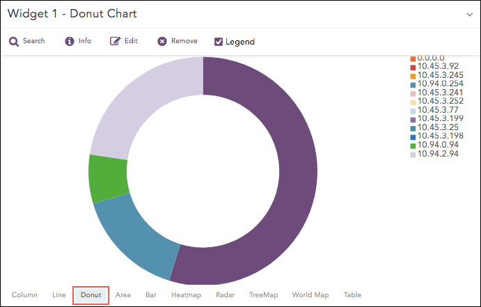
Donut Chart
The following query gives the output shown above.
source_address=* | chart sum(datasize) as Datasize by source_address
Note
From LogPoint v5.5.0, the Pie chart has been replaced with the Donut chart. The Donut charts automatically replace any Pie charts created in earlier versions of LogPoint.
The Donut chart supports a single aggregation response types for representation of search results in the visualization. It is :
Response Type |
General Syntax |
|---|---|
| chart aggregation_parameter by grouping_parameter1, grouping_parameter2, ........, grouping_parametern
|
Example:
source_address=* | chart count() by source_address
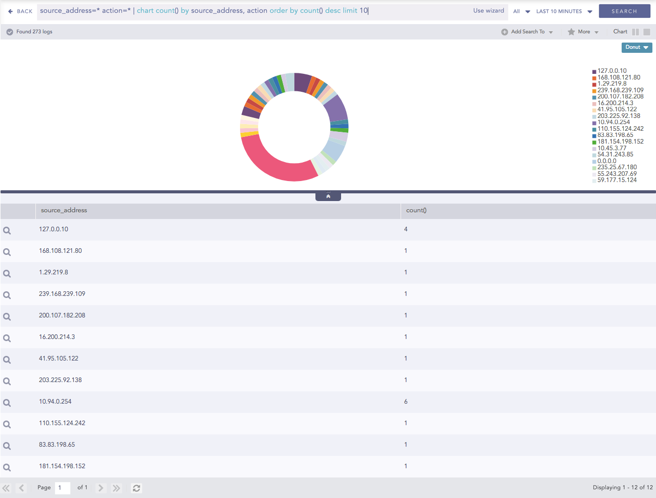
Donut chart for Single Aggregation with Grouping
You can refer to Single Aggregation with Grouping for more details.